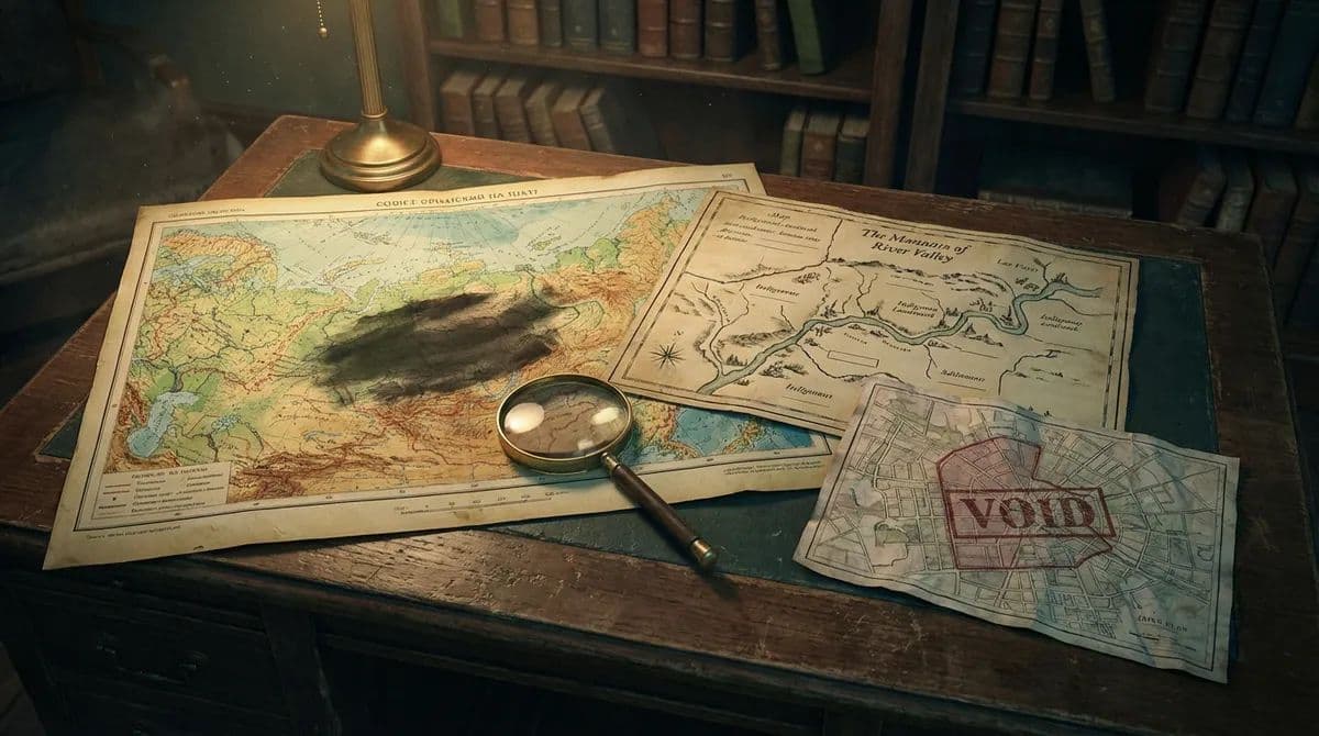
The Cartographer's Silence: Places Deliberately Left Off Maps

Carmen Ruiz
Writer
In 1938, the Soviet cartographic authorities issued a directive that would reshape the geography of a superpower. All publicly available maps of the Soviet Union were to be systematically falsified. Roads would be moved. Rivers would be shifted. Entire cities would be repositioned by ten, twenty, fifty kilometers from their actual locations. The scale of the deception was breathtaking — not a single public map produced in the USSR between 1938 and the late 1980s bore an accurate relationship to the physical territory it claimed to represent. The purpose was military: if enemy forces captured Soviet maps, the maps would lead them astray. But the consequence was something stranger and more profound. For half a century, Soviet citizens navigated their own country using maps that were, by design, wrong. The map was not the territory. The map was a lie about the territory. And the territory itself — the actual, physical landscape with its real cities and real roads — became, in a sense, a curious place to visit that officially did not exist where it actually was.
This is the extreme case, but the principle it illustrates is universal: maps are not neutral documents. They are arguments. They include what the mapmaker considers important and exclude what the mapmaker considers irrelevant, dangerous, or politically inconvenient. Every map is a record of choices — what to name, what to measure, what to depict, and what to leave in the silence of blank space. To read a map critically, as the geographer Denis Wood argues, is to ask not just "what is shown?" but "what is not shown, and why?" The answers to that second question constitute an alternative travel guide to the politics of space — a guide to the places that power has chosen to make invisible.
The Soviet Cartographic Lie
The Soviet falsification program, directed by the NKVD (later the KGB), was the most systematic attempt in history to weaponize cartography. The program operated on multiple levels. At the simplest, coordinates were shifted — Moscow's public maps placed landmarks in slightly wrong positions, enough to render satellite-targeted navigation useless but not enough to make the maps unusable for daily commuting. At the most extreme, entire features were erased. Closed cities — the secret nuclear research and military production centers scattered across the Soviet Union — were removed from all public maps, their populations (sometimes exceeding 100,000) rendered statistically invisible.
Chelyabinsk-65, now known as Ozyorsk, was a city of 80,000 people that did not appear on any map until 1994. It was the site of the Mayak nuclear complex, which produced plutonium for the Soviet weapons program and which, in 1957, suffered a catastrophic explosion — the Kyshtym disaster, the third-worst nuclear accident in history — that contaminated 20,000 square kilometers. Because neither the city nor the facility existed on any map, the disaster was hidden for decades. The affected population was evacuated without explanation. The contaminated territory was closed but not marked. Travelers who wandered too close were turned back by unmarked military checkpoints guarding a place that, according to every available map, was not there.
The legacy of Soviet cartographic falsification persists in unexpected ways. Modern Russian topographic maps, produced after the program ended, are highly accurate. But the habit of secrecy remains. Military facilities, certain industrial sites, and some infrastructure features are still censored or obscured on publicly available maps, including digital ones. And in the former Soviet states — the Baltic countries, Ukraine, Georgia, the Central Asian republics — the transition from false Soviet maps to accurate national ones is still incomplete, creating zones where the cartographic record is confused, contradictory, and unreliable.
Colonial Cartography and the Unnamed
If Soviet maps lied about where things were, colonial maps lied about what things were called — and, in doing so, about who they belonged to. The European mapping of Africa, the Americas, Australia, and the Pacific was not a neutral act of measurement. It was an act of possession. To name a mountain, a river, a bay — to write that name on a map in a European language — was to claim it for the European geographic imagination, overwriting whatever name the indigenous inhabitants had used, in some cases for thousands of years.
The process was often deliberate. Captain James Cook, charting the coast of Australia in 1770, named features for British patrons, colleagues, and royalty — Botany Bay, Cape Tribulation, the Endeavour River — while recording almost none of the Aboriginal names for these places, names that encoded millennia of ecological and spiritual knowledge. The result was a map that depicted Australia as a land without cultural history — a terra nullius, empty land, awaiting European possession. The map was not merely inaccurate. It was an instrument of dispossession, rendering invisible the very people whose land it claimed to describe.
This pattern repeated across every colonized continent. In North America, the Algonquin name "Moswetuset" — meaning "hill shaped like an arrowhead" — became "Massachusetts." The Lenape name "Mannahatta" — meaning "island of many hills" — became "Manhattan." In each case, the indigenous name was either erased entirely or corrupted into a form that obscured its original meaning, severing the connection between the name and the knowledge it carried. A map of pre-colonial North America, reconstructed from surviving oral traditions and early contact records, reveals a landscape saturated with meaning — every river bend, every hill, every grove named for a specific ecological, historical, or spiritual association. The colonial map replaced this dense web of meaning with a sparse grid of European names, many of them arbitrary, most of them conveying nothing about the landscape they described.
The recovery of indigenous place names is now a significant movement in several countries. In Australia, dual naming — pairing European names with their Aboriginal equivalents — has become standard practice in many jurisdictions. Uluru/Ayers Rock, Kosciuszko/Jagungal, and Denali (restored from McKinley in 2015 in the United States) are the most prominent examples, but thousands of smaller restorations are underway. Each restoration is a small act of cartographic justice — a recognition that the first name was the real one, and that the second was an imposition.
Redlining: The Map as Weapon
In the United States, the most consequential act of cartographic silence was performed not by a foreign power but by the federal government. In the 1930s, the Home Owners' Loan Corporation (HOLC), a New Deal agency, created color-coded maps of every major American city, grading neighborhoods from "A" (green, "best") to "D" (red, "hazardous"). The grading criteria were explicitly racial: neighborhoods with Black, immigrant, or mixed-race populations were automatically colored red, regardless of their physical condition, economic activity, or housing quality. The term "redlining" — still in common use — comes directly from these maps.
The HOLC maps were not publicly distributed. They were used internally by banks, insurance companies, and real estate agents to determine who could get a mortgage, who could get insurance, and where investment would flow. The effect was systematic disinvestment in communities of color — a withdrawal of capital so complete and so sustained that its physical consequences are visible today, nearly a century later. The neighborhoods that were redlined in the 1930s are, overwhelmingly, the neighborhoods that still show the highest poverty rates, the worst health outcomes, and the most deteriorated housing stock. The map did not describe reality. It created reality. It drew a line, and everything inside the line was starved.
The HOLC maps are now digitized and publicly available through the Mapping Inequality project, and walking through a redlined neighborhood with the historical map in hand is one of the most powerful local secrets travel guide experiences available in any American city. The line is invisible — there is no wall, no fence, no marker. But the difference on either side is palpable. The trees are different (redlined neighborhoods were denied the municipal investment that funded tree planting). The sidewalks are different. The buildings are different. The map was silent about these neighborhoods — it marked them only as zones of risk — and that silence shaped everything that followed.
Sacred Silences
Not all cartographic absences are acts of power. Some are acts of protection. Indigenous communities around the world have deliberately withheld the locations of sacred sites from maps, understanding that visibility on a map is an invitation to visit — and that some places are not meant to be visited by everyone.
The Aboriginal concept of "secret sacred" sites in Australia — places associated with creation stories, initiation ceremonies, or ancestral beings that are restricted to specific kinship groups, genders, or initiated individuals — presents a fundamental challenge to Western cartography, which assumes that all places are equally mappable and that mapping is inherently beneficial. For Aboriginal Australians, certain places are powerful precisely because they are not known to outsiders, and to place them on a map — to make them visible, accessible, findable — is to violate them. The protection of these sites requires not just physical barriers but cartographic silence.
Similar practices exist among the Maori of New Zealand, the Hopi and Navajo of the American Southwest, and indigenous communities in the Amazon basin. In each case, the decision not to map is an assertion of sovereignty — a refusal to surrender the knowledge of where things are to a system of representation controlled by outsiders. The blank space on the map is not emptiness. It is intention.
Digital Maps and New Silences
The transition from paper maps to digital ones has not eliminated cartographic silence — it has transformed it. Google Maps, the most widely used mapping platform in the world, makes its own decisions about what to show and what to hide, and those decisions are shaped by commercial interests, government requests, and algorithmic priorities that are largely opaque to users.
Buildings are blurred in satellite imagery at the request of governments — military installations, intelligence headquarters, royal palaces. Entire countries have contested their borders on Google Maps, leading to different versions of the same map being served to users in different countries. And the algorithmic prioritization of commercial listings means that a neighborhood's representation on Google Maps is shaped by its economic activity: areas with many restaurants, shops, and hotels appear rich with pins and labels, while residential neighborhoods — equally real, equally inhabited — appear blank and featureless.
The digital map, like its paper predecessor, is an argument about what matters. The traveler who relies on Google Maps to navigate a city is navigating not the city itself but Google's interpretation of the city — an interpretation that emphasizes commerce, connectivity, and the interests of advertisers. The curious places to visit that do not appear on the digital map are not invisible because they do not exist. They are invisible because they do not transact.